## Changes
- Adds the following high level access scopes, each with `read` and
`write` levels:
- `activitypub`
- `admin` (hidden if user is not a site admin)
- `misc`
- `notification`
- `organization`
- `package`
- `issue`
- `repository`
- `user`
- Adds new middleware function `tokenRequiresScopes()` in addition to
`reqToken()`
- `tokenRequiresScopes()` is used for each high-level api section
- _if_ a scoped token is present, checks that the required scope is
included based on the section and HTTP method
- `reqToken()` is used for individual routes
- checks that required authentication is present (but does not check
scope levels as this will already have been handled by
`tokenRequiresScopes()`
- Adds migration to convert old scoped access tokens to the new set of
scopes
- Updates the user interface for scope selection
### User interface example
<img width="903" alt="Screen Shot 2023-05-31 at 1 56 55 PM"
src="654766ec-2143-4f59-9037-3b51600e32f3">
<img width="917" alt="Screen Shot 2023-05-31 at 1 56 43 PM"
src="1ad64081-012c-4a73-b393-66b30352654c">
## tokenRequiresScopes Design Decision
- `tokenRequiresScopes()` was added to more reliably cover api routes.
For an incoming request, this function uses the given scope category
(say `AccessTokenScopeCategoryOrganization`) and the HTTP method (say
`DELETE`) and verifies that any scoped tokens in use include
`delete:organization`.
- `reqToken()` is used to enforce auth for individual routes that
require it. If a scoped token is not present for a request,
`tokenRequiresScopes()` will not return an error
## TODO
- [x] Alphabetize scope categories
- [x] Change 'public repos only' to a radio button (private vs public).
Also expand this to organizations
- [X] Disable token creation if no scopes selected. Alternatively, show
warning
- [x] `reqToken()` is missing from many `POST/DELETE` routes in the api.
`tokenRequiresScopes()` only checks that a given token has the correct
scope, `reqToken()` must be used to check that a token (or some other
auth) is present.
- _This should be addressed in this PR_
- [x] The migration should be reviewed very carefully in order to
minimize access changes to existing user tokens.
- _This should be addressed in this PR_
- [x] Link to api to swagger documentation, clarify what
read/write/delete levels correspond to
- [x] Review cases where more than one scope is needed as this directly
deviates from the api definition.
- _This should be addressed in this PR_
- For example:
```go
m.Group("/users/{username}/orgs", func() {
m.Get("", reqToken(), org.ListUserOrgs)
m.Get("/{org}/permissions", reqToken(), org.GetUserOrgsPermissions)
}, tokenRequiresScopes(auth_model.AccessTokenScopeCategoryUser,
auth_model.AccessTokenScopeCategoryOrganization),
context_service.UserAssignmentAPI())
```
## Future improvements
- [ ] Add required scopes to swagger documentation
- [ ] Redesign `reqToken()` to be opt-out rather than opt-in
- [ ] Subdivide scopes like `repository`
- [ ] Once a token is created, if it has no scopes, we should display
text instead of an empty bullet point
- [ ] If the 'public repos only' option is selected, should read
categories be selected by default
Closes#24501Closes#24799
Co-authored-by: Jonathan Tran <jon@allspice.io>
Co-authored-by: Kyle D <kdumontnu@gmail.com>
Co-authored-by: silverwind <me@silverwind.io>
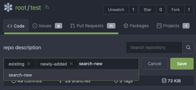
Use up and down arrow key to select repositories

---------
Co-authored-by: silverwind <me@silverwind.io>
Feel free to close this if there isn't interest.
The tree view looks amazing, and all of our users are really enjoying it
(major kudos to developers!), but only IF I tell them it exists!
Essentially, the file tree view as it is effectively undiscoverable.
This PR changes the default state for the tree view to open, which
should significantly help with discoverability.
An alternative could be to reserve more horizontal space, as a typical
accordion panel would look (eg. VS Code), eg.

Part of #24728

- The timestamp shows local time and is parsed by `date.toLocaleString`;
- "show seconds" and "show timestamps" are mutually exclusive, and they
can be both hidden.


89531e54-37b7-4400-a6a0-bb3cc69eb6f5

Update for timestamp format:

<img width="306" alt="Screen Shot 2023-05-25 at 09 07 47"
src="2d99768d-d39c-4c9e-81a2-7bc7470399dd">

---------

Co-authored-by: silverwind <me@silverwind.io>
Co-authored-by: wxiaoguang <wxiaoguang@gmail.com>
Follow #21012, #22399
Replace #24983, fix#24938
Help #24956
Now, the `window.config.pageData.diffFileInfo` itself is a reactive
store, so it's quite easy to sync values/states by it, no need to do
"doLoadMoreFiles" or "callback".
Screenshot: these two buttons both work. After complete loading, the UI
is also right.
<details>


</details>
- Fix bold helper classes that were broken because of CSS syntax error
- Refined the repo list CSS and layout
- Removing bold
- Downsize the mirror icon to fit
- Fix icon positions
- Adapted the org list to match
- Center the '+' icon and mute it

<img width="385" alt="Screenshot 2023-05-25 at 18 38 31"
src="ac8d6efb-5751-4845-a4ab-db1ddaf36ec3">
<img width="384" alt="Screenshot 2023-05-25 at 18 30 29"
src="bbd39ae7-da9d-4c6f-bfe3-42f28b7a74c3">
- Various color tweaks
- Add sticky positioning to left sidebar, right header and right step
header
- Adjust margins and border radiuses
<img width="1235" alt="Screenshot 2023-05-23 at 11 18 06"
src="f601b00d-c7f2-43de-89f2-3ac55f2d9cdc">
<img width="1239" alt="Screenshot 2023-05-23 at 11 18 18"
src="a2d24cc9-29fa-4c17-906b-84feea14b889">


---------
Co-authored-by: yp05327 <576951401@qq.com>
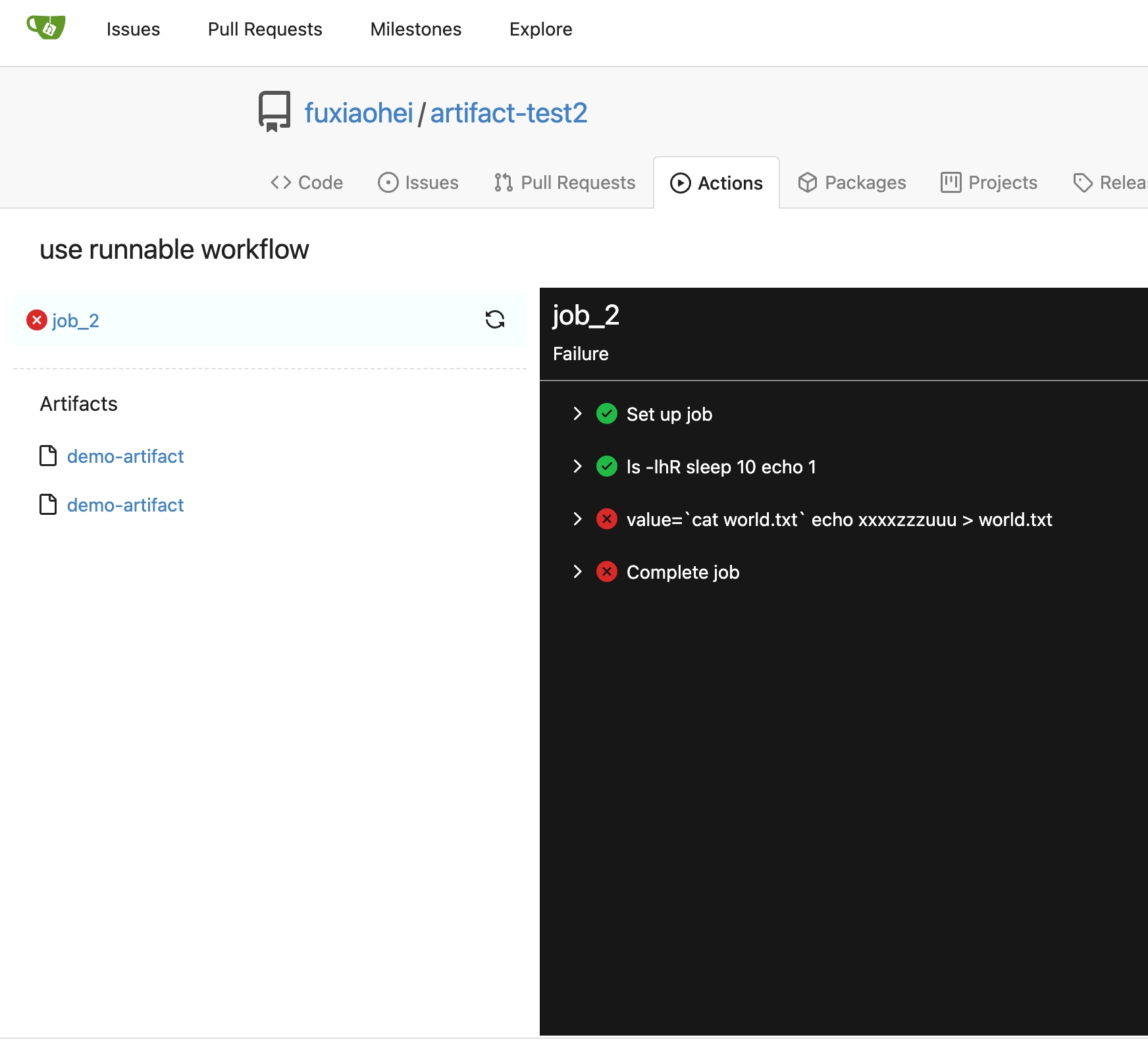
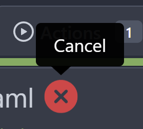
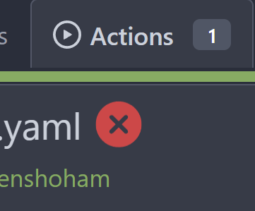
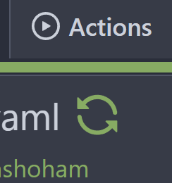
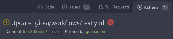
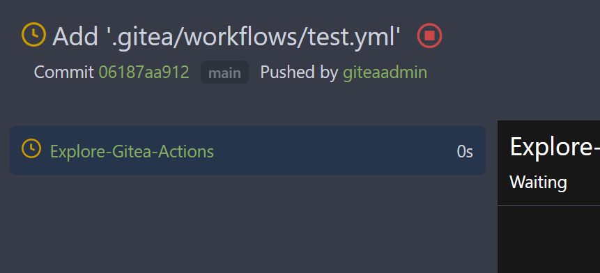
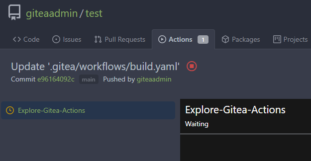
Close#24625
Main changes:
1. For the left panel, show rerun icon only on hover, and add style when
the job is selected, and removed icon on the "rerun all" button and
modify the text on the button
cc437a17-d2e9-4f1b-a8cf-f56e53962767
2. Adjust fonts, and add on hover effects to the log lines. And add
loading effect when the job is done and the job step log is expanded for
the first time. (With reference to github)
2808d77d-f402-4fb0-8819-7aa0a018cf0c
3. Add `gt-ellipsis` to `step-summary-msg` and `job-brief-name`
<img width="898" alt="ellipsis"
src="e2fb7049-3125-4252-970d-15b0751febc7">
4. Fixed
https://github.com/go-gitea/gitea/issues/24625#issuecomment-1541380010
by adding explicit conditions to `ActionRunStatus.vue` and `status.tmpl`
5. Adjust some css styles
---------
Co-authored-by: silverwind <me@silverwind.io>
There was some recent discussion about this in Discord `ui-design`
channel and the conclusion was that
https://github.com/go-gitea/gitea/issues/24305 should have fixed their
OS font installation to have semibold weights.

I have now tested this 601 weight on a Windows 10 machine on Firefox
myself, and I immediately noticed that bold was excessivly bold and
rendering as 700 because browsers are biased towards bolder fonts. So
revert this back to the previous value.
It will show the calculated commit status state of the latest commit on
the default branch for each repository in the dashboard repo list
- Closes#15620
# Before

# After

---------
Signed-off-by: Yarden Shoham <git@yardenshoham.com>
Co-authored-by: delvh <dev.lh@web.de>
Co-authored-by: Giteabot <teabot@gitea.io>
Fix regression from https://github.com/go-gitea/gitea/pull/24476 where
the `svg.svg` class misaligns SVG icons across the site and streched
buttons unintentionally in vertical height.

Before (button 30.3px):
<img width="157" alt="Screenshot 2023-05-11 at 22 09 42"
src="0fd137ab-ab52-4cf8-afca-c45776d526d0">

After (button 30px):
<img width="160" alt="Screenshot 2023-05-11 at 22 09 59"
src="4b741f4b-0fd2-4fae-9bee-16a7deb098e8">

[vertical-align:
middle](https://developer.mozilla.org/en-US/docs/Web/CSS/vertical-align)
is not suitable to align icons to text because

> Aligns the middle of the element with the baseline plus half the
x-height of the parent.

Example of `vertical-align: middle` from MDN:

<img width="232" alt="Screenshot 2023-05-11 at 22 29 28"
src="179fb756-85a1-4cab-8219-1a4958f333e2">

So I think the
[existing](365bb77a54/web_src/css/svg.css (L3))
`vertical-align: text-top` is generally still the best bet:

<img width="241" alt="Screenshot 2023-05-11 at 22 34 24"
src="0cd6edf5-12c0-4bdb-8771-a900f5ba2d35">

Co-authored-by: Giteabot <teabot@gitea.io>
Before:

After:

private or internal repos have `lock` icon, no need to add highlights to
them.
This one doesn't look very good as a real button (at least not in the
ways I tried), so I've opted to simply add a tooltip for it.
# Before

# After

Signed-off-by: Yarden Shoham <git@yardenshoham.com>
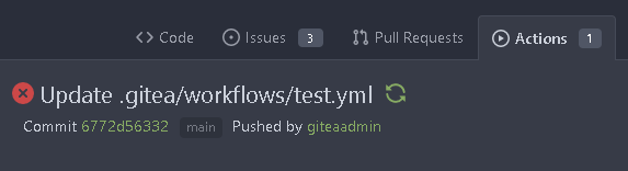
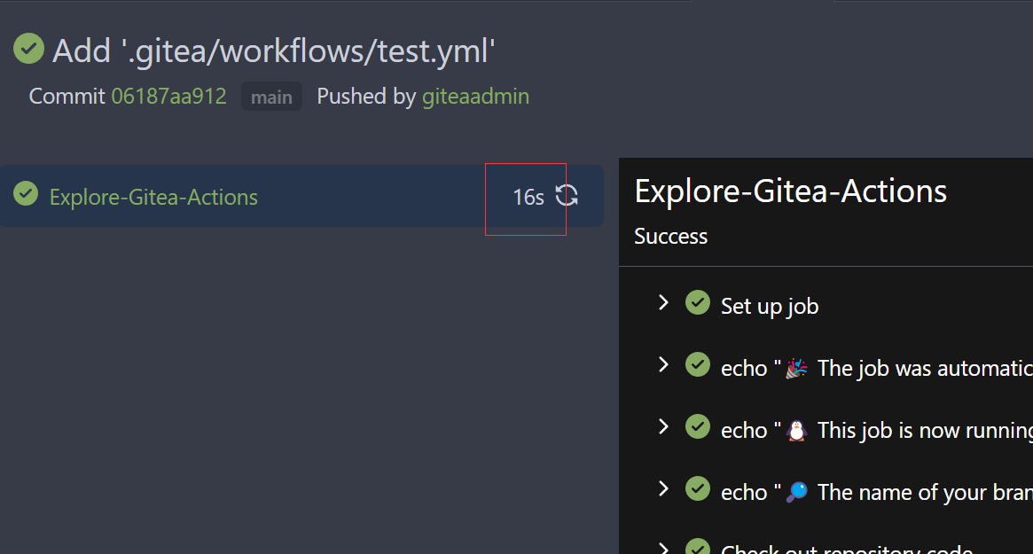
To clearly communicate the current state of the action


---------
Signed-off-by: Yarden Shoham <git@yardenshoham.com>
Follow #22719
### Major changes
1. `ServerError` doesn't do format, so remove the `%s`
2. Simplify `RenderBranchFeed` (slightly)
3. Remove unused `BranchFeedRSS`
4. Make `feed.RenderBranchFeed` respect `EnableFeed` config
5. Make `RepoBranchTagSelector.vue` respect `EnableFeed` setting,
otherwise there is always RSS icon
6. The `(branchURLPrefix + item.url).replace('src', 'rss')` doesn't seem
right for all cases, for example, the string `src` could appear in
`branchURLPrefix`, so we need a separate `rssURLPrefix`
7. The `<a>` in Vue menu needs `@click.stop`, otherwise the menu itself
would be triggered at the same time
8. Change `<a><button></button></a>` to `<a role=button>`
9. Use `{{PathEscapeSegments .TreePath}}` instead of `{{range $i, $v :=
.TreeNames}}/{{$v}}{{end}}`
Screenshot of changed parts:
<details>
</details>
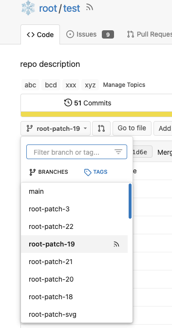
### Other thoughts
Should we remove the RSS icon from the branch dropdown list? It seems
too complex for a list UI, and users already have the chance to get the
RSS feed URL from "branches" page.
---------
Co-authored-by: 6543 <6543@obermui.de>
Co-authored-by: silverwind <me@silverwind.io>
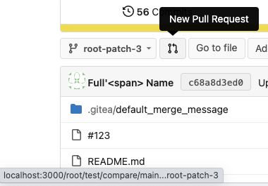
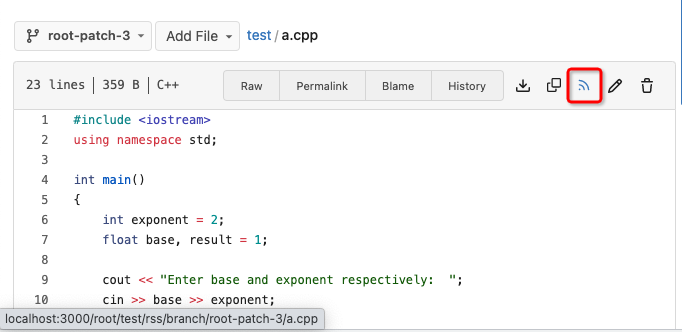
Fix#22228 adding RSS feeds for branches and files.
RSS feeds are accessed through:
* [gitea]/src/branch/{branch}.rss
* [gitea]/src/branch/{branch}/{file_name}.rss
No changes have been made to the UI to expose the feed urls for branches
and files.
I found that some lint warnings in my editor are conflicting, and I
believe the root cause is using lints designed for Vue 2 instead of Vue
3. We moved to Vue 3 in #20044.

I verified that the explicitly disabled rules in the changed file are
still part of the `vue/vue3-recommended` set.

See [Available rules -
eslint-plugin-vue](https://eslint.vuejs.org/rules/) for a full list of
lints.
Close#23680
Some CLI programs use "\r" and control chars to print new content in
current line.
So, the strings in one line are actually from
`\rReading...1%\rReading...5%\rReading...100%`
This PR tries to make the output better.
Although it seems that some different purposes are mixed in this PR,
however, they are all related, and can be tested together, so I put them
together to save everyone's time.
Diff: `+79 −84`, everything becomes much better.
### Improve the dropdown settings.
Move all fomantic-init related code into our `fomantic.js`
Fine-tune some dropdown global settings, see the comments.
Also help to fix the first problem in #23625 , cc: @yp05327
The "language" menu has been simplified, and it works with small-height
window better.
### Use SVG instead of `<i class="delete icon">`
It's also done by `$.fn.dropdown.settings.templates.label` , cc:
@silverwind
### Remove incorrect `tabable` CSS class
It doesn't have CSS styles, and it was only in Vue. So it's totally
unnecessary, remove it by the way.
### Improve the Repo Topic Edit form
* Simplify the code
* Add a "Cancel" button
* Align elements
Before:
<details>
</details>
After:
Follow:
* #23574
* Remove all ".tooltip[data-content=...]"

Major changes:

* Remove "tooltip" class, use "[data-tooltip-content=...]" instead of
".tooltip[data-content=...]"
* Remove legacy `data-position`, it's dead code since last Fomantic
Tooltip -> Tippy Tooltip refactoring
* Rename reaction attribute from `data-content` to
`data-reaction-content`
* Add comments for some `data-content`: `{{/* used by the form */}}`
* Remove empty "ui" class
* Use "text color" for SVG icons (a few)