Part of #27065

This PR touches functions used in templates. As templates are not static
typed, errors are harder to find, but I hope I catch it all. I think
some tests from other persons do not hurt.
I think it's better if the primary actions have primary color instead of
green which fits better into the overall single-color UI design. This PR
currently replaces every green button with primary:

<img width="141" alt="Screenshot 2023-09-16 at 14 07 59"
src="843c1e50-4fb2-4ec6-84ba-0efb9472dcbe">
<img width="161" alt="Screenshot 2023-09-16 at 14 07 51"
src="9442195a-a3b2-4a42-b262-8377d6f5c0d1">

Modal actions now use uncolored/primary instead of previous green/red
colors. I also removed the box-shadow on all basic buttons:

<img width="259" alt="Screenshot 2023-09-16 at 14 16 39"
src="5beea529-127a-44b0-8d4c-afa7b034a490">
<img width="261" alt="Screenshot 2023-09-16 at 14 17 42"
src="4757f7b2-4d46-49bc-a797-38bb28437b88">

The change currently includes the "Merge PR" button, for which we might
want to make an exception to match the icon color there:

<img width="442" alt="Screenshot 2023-09-16 at 14 33 53"
src="993ac1a5-c94d-4895-b76c-0d872181a70b">
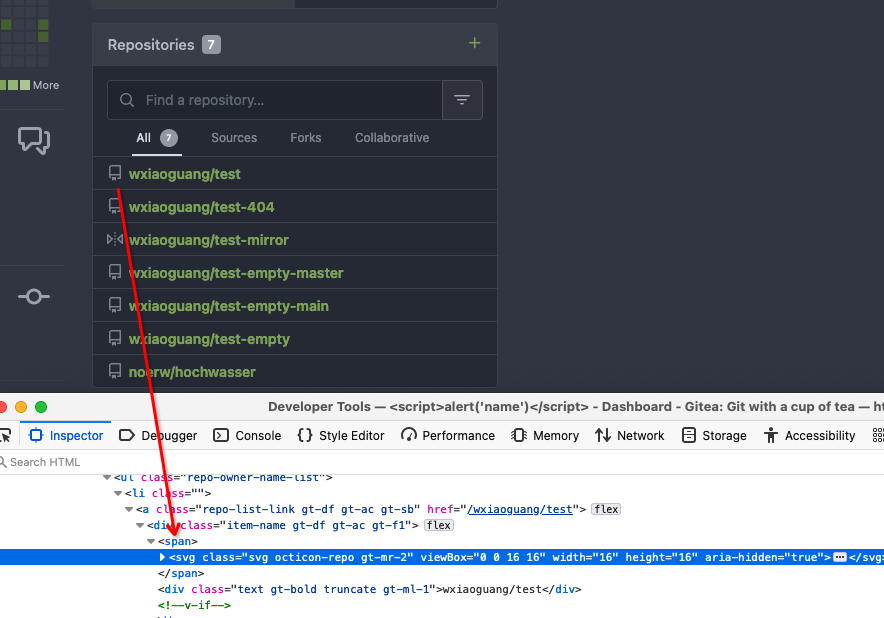
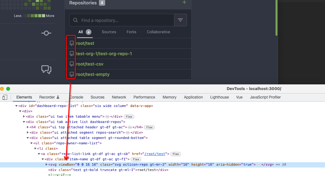
Fix#26731
Almost all "tabindex" in code are incorrect.
1. All "input/button" by default are focusable, so no need to use "tabindex=0"
2. All "div/span" by default are not focusable, so no need to use "tabindex=-1"
3. All "dropdown" are focusable by framework, so no need to use "tabindex"
4. Some tabindex values are incorrect (eg: `new_form.tmpl`), so remove them
Co-authored-by: Giteabot <teabot@gitea.io>
Fix https://github.com/go-gitea/gitea/pull/26448#issuecomment-1676194200

I accidentally set grab cursor for project columns instead of issue
cards, which actually turned out not to be a problem - with proper check
for the default column, which can't be moved.

---------

Co-authored-by: delvh <dev.lh@web.de>
Co-authored-by: Giteabot <teabot@gitea.io>
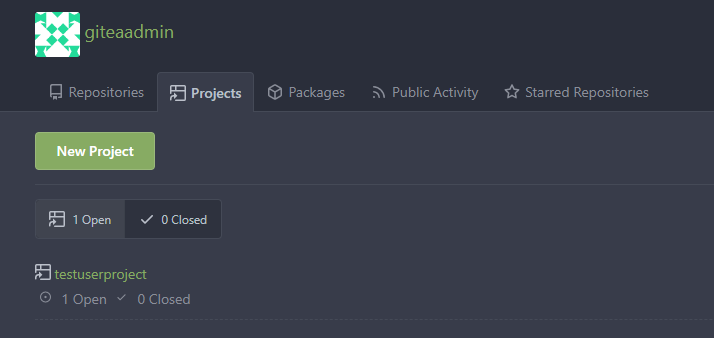
This PR refactors a bunch of projects-related code, mostly the
templates.
The following things were done:
- rename boards to columns in frontend code
- use the new `ctx.Locale.Tr` method
- cleanup template, remove useless newlines, classes, comments
- merge org-/user and repo level project template together
- move "new column" button into project toolbar
- move issue card (shared by projects and pinned issues) to shared
template, remove useless duplicated styles
- add search function to projects (to make the layout more similar to
milestones list where it is inherited from 😆)
- maybe more changes I forgot I've done 😆Closes#24893
After:


---------
Co-authored-by: silverwind <me@silverwind.io>
Changes:
* Rename gt-tl/gt-tc/gt-tr to gt-text-left/gt-text-center/gt-text-right
* The gt-ab and gt-br-0 are removed because they are not needed anymore
* Fix the clone dropdown button padding by ":not(.icon)"
Before:
<details>

</details>
After:
<details>

</details>
Fixes#25758
Co-authored-by: Giteabot <teabot@gitea.io>
Fix ::User Profile Page Project Tab Have Inconsistent Layout and Style
Added the big_avator for consistency in the all header_items tabs.
Fixes: #24871
> ### Description
> in the user profile page the `Packages` and `Projects` tab have small
icons for user but other tabs have bigger profile picture with user
info:
>
> ### Screenshots
> ### **For Packages And Projects:**
>

>
> ### **For Other Tabs:**
>

>
## Before

## After changes
Project View
<img width="1394" alt="image"
src="95d181d7-8e61-496d-9899-7b825c91ad56">
Packages View
<img width="1378" alt="image"
src="7f5fd60f-6b18-4fa8-8c56-7b0d45d1a610">
## Org view for projects page
<img width="1385" alt="image"
src="6400dc89-a5ae-4f0a-831b-5b6efa020d89">
## Org view for packages page
<img width="1387" alt="image"
src="4e1e9ffe-1e4b-4334-8657-de11b5fd31d0">
---------
Co-authored-by: wxiaoguang <wxiaoguang@gmail.com>
Co-authored-by: Giteabot <teabot@gitea.io>
Co-authored-by: silverwind <me@silverwind.io>
Should look exactly like before for normal dividers. "Horizontal" ones
look better because they no longer use image backgrounds.

<img width="917" alt="Screenshot 2023-06-27 at 19 07 56"
src="d97d8dec-6859-44a8-85ba-e4549b4dd9df">

<img width="914" alt="Screenshot 2023-06-27 at 19 05 58"
src="8bf98544-2d82-4ebf-ac68-d6dc237bd6b2">

<img width="1246" alt="Screenshot 2023-06-27 at 19 00 42"
src="36a6bb21-6029-4f53-8bee-535f55c66fed">

<img width="344" alt="Screenshot 2023-06-27 at 18 58 15"
src="a9e70aee-8e6b-4ea1-9e93-19c9f96aec6e">
<img width="823" alt="Screenshot 2023-06-27 at 18 56 22"
src="e7a497cd-f262-4683-8872-23c3c8cce32f">

<img width="330" alt="Screenshot 2023-06-27 at 19 21 11"
src="42f24149-a655-4c7e-bd26-8ab52db6446b">
Numerous small UI fixes:

- Fix double border in collaborator list
- Fix system notice table background
- Mute links in repo and org lists
- Downsize projects edit buttons
- Improve milestones and project list rendering
- Condense milestone list entry to a single line of "metas"
- Mute ".." button in repo files list
Various fixes to pages or elements which were looking ugly on mobile.
<details>
<summary>Screenshots</summary>


</details>
Co-authored by @silverwind
---------
Co-authored-by: silverwind <me@silverwind.io>
We can reuse the recently created subtemplate here. I also checked the
whole templates for similar constructs, these appear to be the only one.

Co-authored-by: Giteabot <teabot@gitea.io>
Follow:
* #23574
* Remove all ".tooltip[data-content=...]"

Major changes:

* Remove "tooltip" class, use "[data-tooltip-content=...]" instead of
".tooltip[data-content=...]"
* Remove legacy `data-position`, it's dead code since last Fomantic
Tooltip -> Tippy Tooltip refactoring
* Rename reaction attribute from `data-content` to
`data-reaction-content`
* Add comments for some `data-content`: `{{/* used by the form */}}`
* Remove empty "ui" class
* Use "text color" for SVG icons (a few)
This improves a lot of accessibility shortcomings.
Every possible instance of `<div class="button">` matching the command
`ag '<[^ab].*?class=.*?[" ]button[ "]' templates/ | grep -v 'dropdown'`
has been converted when possible.
divs with the `dropdown` class and their children were omitted as
1. more analysis must be conducted whether the dropdowns still work as
intended when they are a `button` instead of a `div`.
2. most dropdowns have `div`s as children. The HTML standard disallows
`div`s inside `button`s.
3. When a dropdown child that's part of the displayed text content is
converted to a `button`, the dropdown can be focused twice

Further changes include that all "gitea-managed" buttons with JS code
received an `e.preventDefault()` so that they don't accidentally submit
an underlying form, which would execute instead of cancel the action.
Lastly, some minor issues were fixed as well during the refactoring.

## Future improvements

As mentioned in
https://github.com/go-gitea/gitea/pull/23337#discussion_r1127277391,
`<a>`s without `href` attribute are not focusable.
They should later on be converted to `<button>`s.

---------

Co-authored-by: wxiaoguang <wxiaoguang@gmail.com>
Co-authored-by: silverwind <me@silverwind.io>
Co-authored-by: techknowlogick <techknowlogick@gitea.io>
Co-authored-by: Lunny Xiao <xiaolunwen@gmail.com>
In #22767, we changed the class of `Edit Column` button from `red` to
`primary`
But `red` is used to find this button in js.....

---------

Co-authored-by: techknowlogick <techknowlogick@gitea.io>
Co-authored-by: zeripath <art27@cantab.net>
A part of https://github.com/go-gitea/gitea/pull/22865

We have edit buttons in projects list page and project view page.
But after user edit a project, it will always redirect to the projects
list page.
Previously, a 500 response was returned when
- an issue had assignees
- the issue was assigned to a project
- you tried to view this project

Co-authored-by: techknowlogick <techknowlogick@gitea.io>
This branch continues the work of #23092 and attempts to rid the
codebase of any `nil` contexts when using a `RenderContext`.

Anything that renders markdown or does post processing may call
`markup.sha1CurrentPatternProcessor()`, and this runs
`git.OpenRepository()`, which needs a context. It will panic if the
context is `nil`. This branch attempts to _always_ include a context
when creating a `RenderContext` to prevent future crashes.

Co-authored-by: Kyle D <kdumontnu@gmail.com>
Add a new "exclusive" option per label. This makes it so that when the
label is named `scope/name`, no other label with the same `scope/`
prefix can be set on an issue.

The scope is determined by the last occurence of `/`, so for example
`scope/alpha/name` and `scope/beta/name` are considered to be in
different scopes and can coexist.

Exclusive scopes are not enforced by any database rules, however they
are enforced when editing labels at the models level, automatically
removing any existing labels in the same scope when either attaching a
new label or replacing all labels.

In menus use a circle instead of checkbox to indicate they function as
radio buttons per scope. Issue filtering by label ensures that only a
single scoped label is selected at a time. Clicking with alt key can be
used to remove a scoped label, both when editing individual issues and
batch editing.

Label rendering refactor for consistency and code simplification:

* Labels now consistently have the same shape, emojis and tooltips
everywhere. This includes the label list and label assignment menus.
* In label list, show description below label same as label menus.
* Don't use exactly black/white text colors to look a bit nicer.
* Simplify text color computation. There is no point computing luminance
in linear color space, as this is a perceptual problem and sRGB is
closer to perceptually linear.
* Increase height of label assignment menus to show more labels. Showing
only 3-4 labels at a time leads to a lot of scrolling.
* Render all labels with a new RenderLabel template helper function.

Label creation and editing in multiline modal menu:

* Change label creation to open a modal menu like label editing.
* Change menu layout to place name, description and colors on separate
lines.
* Don't color cancel button red in label editing modal menu.
* Align text to the left in model menu for better readability and
consistent with settings layout elsewhere.

Custom exclusive scoped label rendering:

* Display scoped label prefix and suffix with slightly darker and
lighter background color respectively, and a slanted edge between them
similar to the `/` symbol.
* In menus exclusive labels are grouped with a divider line.

---------

Co-authored-by: Yarden Shoham <hrsi88@gmail.com>
Co-authored-by: Lauris BH <lauris@nix.lv>