Align everything with a new layout.

* Use "baseline" for some special elements, the "flex-item-icon" is for
the issue list only at the moment and I think it should be general
enough now (but not using "flex-item-leading" anymore in this case).
* Make the labels stretch themselves.
1. There is already `gt-ac`, so no need to introduce `flex-item-center`
2. The `flex-item-baseline` and `.flex-item-icon svg { margin-top: 1px
}` seem to be a tricky patch, they don't resolve the root problem, and
still cause misalignment in some cases.
* The root problem is: the "icon" needs to align with the sibling
"title"
* So, make the "icon" and the "title" both have the same height
3. `flex-text-inline` could only be used if the element is really
"inline", otherwise its `vertical-align` would make the box size change.
In most cases, `flex-text-block` is good enough.

---------
Co-authored-by: silverwind <me@silverwind.io>
Co-authored-by: Giteabot <teabot@gitea.io>
Some small dashboard tweaks:

- Remove margin-bottom from divider so first item does not appear to
have un-equal margins
- Restore previous icon color
- Add slight margin-right to icon

Before:
<img width="783" alt="Screenshot 2023-08-31 at 00 10 28"
src="b75f70d7-8704-4afb-866d-fea0484c52d4">

After:
<img width="783" alt="Screenshot 2023-08-31 at 00 10 08"
src="50ed0c47-6f7c-449e-a054-13091369d43f">

---------

Co-authored-by: wxiaoguang <wxiaoguang@gmail.com>
This PR introduces a new UI element type for Gitea called `flex-item`.
It consists of a horizontal card with a leading, main and trailing part:

The idea behind it is that in Gitea UI, we have many cases where we use
this kind of layout, but it is achieved in many different ways:
- grid layout
- `.ui.list` with additional hacky flexbox
- `.ui.key.list` - looks to me like a style set originally created for
ssh/gpg key list, was used in many other places
- `.issue.list` - created for issue cards, used in many other places
- ...
This new style is based on `.issue.list`, specifically the refactoring
of it done in #25750.
In this PR, the new element is introduced and lots of templates are
being refactored to use that style. This allows to remove a lot of
page-specific css, makes many of the elements responsive or simply
provides a cleaner/better-looking way to present information.
A devtest section with the new style is also available.
<details>
<summary>Screenshots (left: before, right: after)</summary>


</details>
---------
Co-authored-by: Giteabot <teabot@gitea.io>
Not too important, but I think that it'd be a pretty neat touch.

Also fixes some layout bugs introduced by a previous PR.

---------

Co-authored-by: Gusted <postmaster@gusted.xyz>
Co-authored-by: Caesar Schinas <caesar@caesarschinas.com>
Co-authored-by: wxiaoguang <wxiaoguang@gmail.com>
Resizing the comment editor can be a very expensive operation because it
triggers page reflows, which on large PRs can take upwards of seconds to
complete. Disable this mechanism on the diff page only where we know
that the page can get large.

Fixes https://github.com/go-gitea/gitea/issues/26201 for the textarea
editor.

I don't think this can be fixed for EasyMDE because as far as I can
tell, it exposes no option to disable this resizing.

---------

Co-authored-by: Giteabot <teabot@gitea.io>
This PR does various modifications on the issue list shared template:
- restructure layout to achieve better responsiveness
- fix various style issues
- restructure styles (better result with less code :)
- remove numerous `gt-*` patches and other unneeded classes -> use
existing css classes
<details>
<summary>Before:</summary>


</details>
<details>
<summary>After:</summary>


</details>
---------
Co-authored-by: silverwind <me@silverwind.io>
Fix ::User Profile Page Project Tab Have Inconsistent Layout and Style
Added the big_avator for consistency in the all header_items tabs.
Fixes: #24871
> ### Description
> in the user profile page the `Packages` and `Projects` tab have small
icons for user but other tabs have bigger profile picture with user
info:
>
> ### Screenshots
> ### **For Packages And Projects:**
>

>
> ### **For Other Tabs:**
>

>
## Before

## After changes
Project View
<img width="1394" alt="image"
src="95d181d7-8e61-496d-9899-7b825c91ad56">
Packages View
<img width="1378" alt="image"
src="7f5fd60f-6b18-4fa8-8c56-7b0d45d1a610">
## Org view for projects page
<img width="1385" alt="image"
src="6400dc89-a5ae-4f0a-831b-5b6efa020d89">
## Org view for packages page
<img width="1387" alt="image"
src="4e1e9ffe-1e4b-4334-8657-de11b5fd31d0">
---------
Co-authored-by: wxiaoguang <wxiaoguang@gmail.com>
Co-authored-by: Giteabot <teabot@gitea.io>
Co-authored-by: silverwind <me@silverwind.io>
Various small enhancements to the actions list. Before and after:

<img width="1264" alt="Screenshot 2023-06-30 at 00 11 40"
src="bb4162ee-cdcf-4a73-b05e-f9521562edbb">
<img width="1264" alt="Screenshot 2023-06-30 at 00 09 51"
src="52a70ea9-4bb3-406e-904b-0fdaafde9582">

---------

Co-authored-by: Giteabot <teabot@gitea.io>
Should look exactly like before for normal dividers. "Horizontal" ones
look better because they no longer use image backgrounds.

<img width="917" alt="Screenshot 2023-06-27 at 19 07 56"
src="d97d8dec-6859-44a8-85ba-e4549b4dd9df">

<img width="914" alt="Screenshot 2023-06-27 at 19 05 58"
src="8bf98544-2d82-4ebf-ac68-d6dc237bd6b2">

<img width="1246" alt="Screenshot 2023-06-27 at 19 00 42"
src="36a6bb21-6029-4f53-8bee-535f55c66fed">

<img width="344" alt="Screenshot 2023-06-27 at 18 58 15"
src="a9e70aee-8e6b-4ea1-9e93-19c9f96aec6e">
<img width="823" alt="Screenshot 2023-06-27 at 18 56 22"
src="e7a497cd-f262-4683-8872-23c3c8cce32f">

<img width="330" alt="Screenshot 2023-06-27 at 19 21 11"
src="42f24149-a655-4c7e-bd26-8ab52db6446b">
- Set
[type=search](https://developer.mozilla.org/en-US/docs/Web/HTML/Element/input/search)
- Disable spellcheck
- Set maxLength 255 that I found in `templates/repo/issue/search.tmpl`
- Remove unnecessary `max-width`, it does nothing

---------

Co-authored-by: delvh <dev.lh@web.de>
Co-authored-by: Giteabot <teabot@gitea.io>
Numerous small UI fixes:

- Fix double border in collaborator list
- Fix system notice table background
- Mute links in repo and org lists
- Downsize projects edit buttons
- Improve milestones and project list rendering
- Condense milestone list entry to a single line of "metas"
- Mute ".." button in repo files list
- Update all JS dependencies
- Enable stylint
[`media-feature-name-value-no-unknown`](https://stylelint.io/user-guide/rules/media-feature-name-value-no-unknown)
- Make use of new features in webpack and text-expander-element
- Tested Swagger and Mermaid

To explain the `text-expander-element` change: Before this version, the
element added a unavoidable space after emoji completion. Now that
https://github.com/github/text-expander-element/pull/36 is in, we gain
control over this space and I opted to remove it for emoji completion
and retain it for `@` mentions.

---------

Co-authored-by: Giteabot <teabot@gitea.io>
So I found this [linter](https://github.com/Riverside-Healthcare/djlint)
which features a mode for go templates, so I gave it a try and it did
find a number of valid issue, like unbalanced tags etc. It also has a
number of bugs, I had to disable/workaround many issues.

Given that this linter is written in python, this does add a dependency
on `python` >= 3.8 and `poetry` to the development environment to be
able to run this linter locally.

- `e.g.` prefixes on placeholders are removed because the linter had a
false-positive on `placeholder="e.g. cn=Search"` for the `attr=value`
syntax and it's not ideal anyways to write `e.g.` into a placeholder
because a placeholder is meant to hold a sample value.
- In `templates/repo/settings/options.tmpl` I simplified the logic to
not conditionally create opening tags without closing tags because this
stuff confuses the linter (and possibly the reader as well).
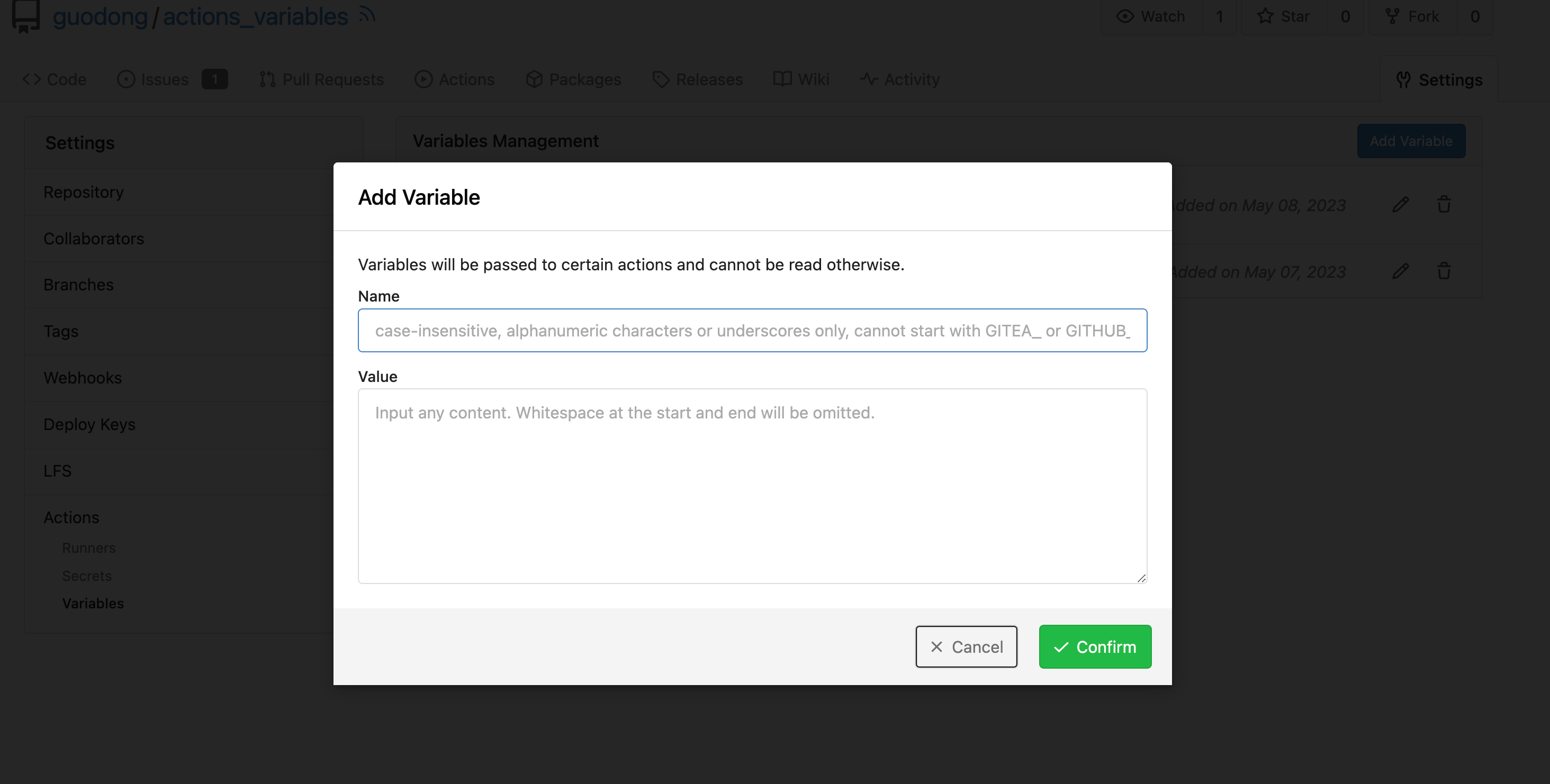
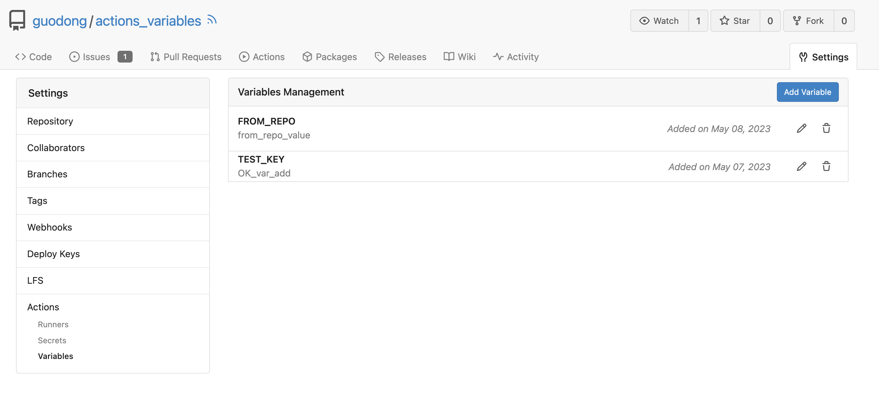
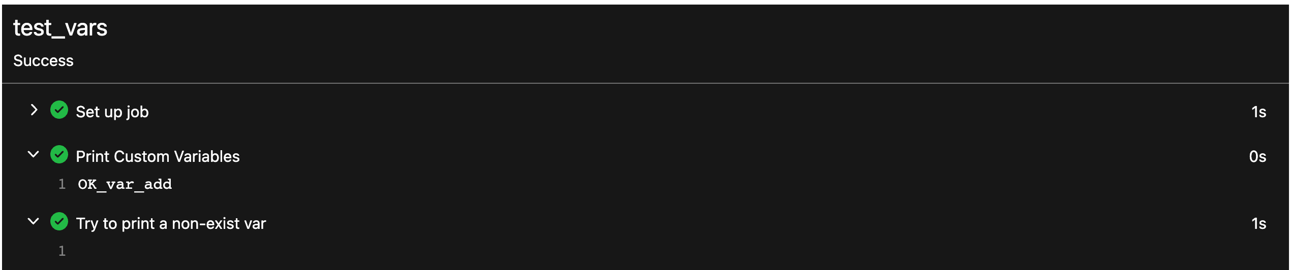
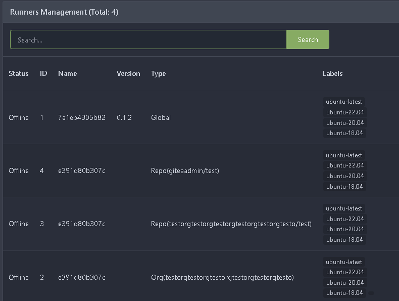
close#24540
related:
- Protocol: https://gitea.com/gitea/actions-proto-def/pulls/9
- Runner side: https://gitea.com/gitea/act_runner/pulls/201
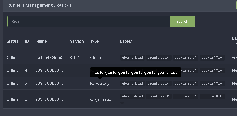
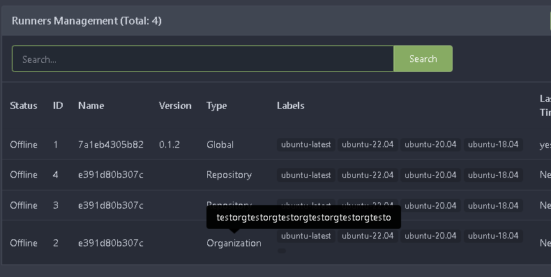
changes:
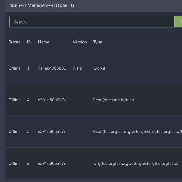
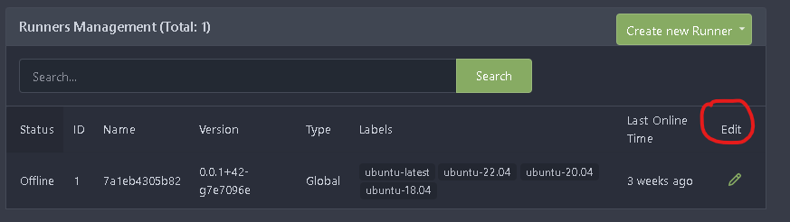
- Add column of `labels` to table `action_runner`, and combine the value
of `agent_labels` and `custom_labels` column to `labels` column.
- Store `labels` when registering `act_runner`.
- Update `labels` when `act_runner` starting and calling `Declare`.
- Users cannot modify the `custom labels` in edit page any more.
other changes:
- Store `version` when registering `act_runner`.
- If runner is latest version, parse version from `Declare`. But older
version runner still parse version from request header.
- Various corrections to button styles, especially secondary
- Remove focus highlight, it's annoying when it stays on button after
press
- Clearly define ghost and link buttons with demos in devtest
- Remove black, grey and tertiary buttons, they should not be used
- Make `arc-green` slightly darker

<img width="1226" alt="image"
src="8d89786a-01ab-40f8-ae5a-e17f40e35084">
<img width="1249" alt="image"
src="83651e6d-3c27-46ff-b8bd-ff344d70e949">

---------

Co-authored-by: wxiaoguang <wxiaoguang@gmail.com>
Co-authored-by: Giteabot <teabot@gitea.io>
If the user is a bot, we'll add a label next to the author link that
says `bot`. I didn't localize `bot` because passing `locale` into the
`autorlink` template would require changing all calls.
# Example
`yardenshoham` is a bot.
## Before

## After

---------
Signed-off-by: Yarden Shoham <git@yardenshoham.com>
- Replace `<table>` with flexbox
- Add issue modification time and issue number
- Remove big title
- Replace tabs with menu items
- Add clicked item deletion on back button cache restoration

---------

Co-authored-by: wxiaoguang <wxiaoguang@gmail.com>
There was some recent discussion about this in Discord `ui-design`
channel and the conclusion was that
https://github.com/go-gitea/gitea/issues/24305 should have fixed their
OS font installation to have semibold weights.

I have now tested this 601 weight on a Windows 10 machine on Firefox
myself, and I immediately noticed that bold was excessivly bold and
rendering as 700 because browsers are biased towards bolder fonts. So
revert this back to the previous value.
Clean up a few cases where avatar dimensions were overwritten via CSS,
which were no longer needed or were possible to set via HTML width.

Also included are two small fixes:

- Fix one more case of incorrect avatar offset on review timeline
- Vertically center avatars in review sidebar

There is more to be done here, but some of the work depends on Fomantic
`comment` module removal, or in the case of org member lists, a refactor
of the `avatarlink` template to accept a size.

<img width="371" alt="image"
src="9c5902fb-2b89-4a7d-a152-60e74c3b2c56">
<img width="306" alt="image"
src="c8d92e2a-91c9-4f4a-a7de-6ae1a6bc0479">

---------

Co-authored-by: Giteabot <teabot@gitea.io>
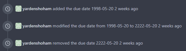
- Very similar to #24550

The correct thing to do is to translate the entire phrase into a single
string. The previous translation assumed all languages have a space
between the "added on" and the date (and that "added on" comes before
the date).

Some languages, like Hebrew, have no space between the "added on" and
the date. For example:
```ini
added_on=נוסף ב-%s
```
("added" becomes נוסף, "on" is ב and when paired with a date we use a
dash to connect ב with the date)

---------

Signed-off-by: Yarden Shoham <git@yardenshoham.com>
Co-authored-by: delvh <dev.lh@web.de>
Fixes https://github.com/go-gitea/gitea/issues/24326.

Set size class and downsize any such buttons that have a dropdown icon
because the dropdown icon increases button height artificially.

[`:has()`](https://developer.mozilla.org/en-US/docs/Web/CSS/:has) is not
supported in Firefox yet, but works fine with the experimental pref
enabled. I see this as a graceful degradation in unsupporting browsers.
This refactors the `shared/datetime/short|long|full` templates into a
template helper function, which allows us to render absolute date times
within translatable phrases.
- Follows #23988
- The first attempt was in #24055
- This should help #22664
Changes:
1. Added the `DateTime` template helper that replaces the
`shared/datetime/short|long|full` templates
2. Used find-and-replace with varying regexes to replace the templates
from step 1 (for example, `\{\{template "shared/datetime/(\S+) \(dict
"Datetime" ([^"]+) "Fallback" ([^\)]+\)?) ?\)?\}\}` -> `{{DateTime "$1
$2 $3}}`)
3. Used the new `DateTime` helper in the issue due date timestamp
rendering
# Before
# After
---------
Signed-off-by: Yarden Shoham <git@yardenshoham.com>
Co-authored-by: wxiaoguang <wxiaoguang@gmail.com>
1. Remove unnecessary `btn-link` `muted` classes
* Link is link, button is button, I can't see a real requirement to make
a button like a link.
* If anyone insists, please help to show me real example from modern
frameworks / websites, how and why they do so.
* No need to duplicate a lot of class names on similar elements
* Declare styles clearly, for example, `markdown-toolbar` itself should
have `display: flex`, but not use `gt-df` to overwrite the `display:
block`.
2. Remove unnecessary `role` attribute
* https://github.com/github/markdown-toolbar-element/issues/70
* The `markdown-toolbar-element` does want to add `role=button`, but
there is a bug.
* So we do the similar thing as upstream does (add the role by JS),
until they fix their bugs.
3. Indent `markdown-switch-easymde` (before it doesn't have a proper
indent)
Screenshot:
Followup of #23876 according to my unreleased review demanding tooltips.
Additionally
- add a `muted` equivalent for buttons
- convert `switch to legacy` to an actual button
- enroll `switch to legacy` in the builtin pseudo focus cycle
- remove spaces between the buttons
The effect of the `muted` class is what you would expect: The button
loses all of its normal styling, and is defined only by its content instead.
This will help reduce a11y infractions in the future, as that was one of
the major points why people didn't use `<button>` tags and decided on a
bad fix (i.e. through `<div>`s) instead.
## Appearance
---------
Co-authored-by: silverwind <me@silverwind.io>
- Add placeholders and aria-label all input fields on these two pages
- Add margin before wiki change message
- Remove labels from release page, replacing them with aria-label
The completion popup now behaves now much more as expected than before
for the raw textarea:
- You can press <kbd>Tab</kbd> or <kbd>Enter</kbd> once the completion
popup is open to accept the selected item
- The menu does not close automatically when moving the cursor
- When you delete text, previously correct suggestions are shown again
- If you delete all text until the opening char (`@` or `:`) after
applying a suggestion, the popup reappears again
- Menu UI has been improved
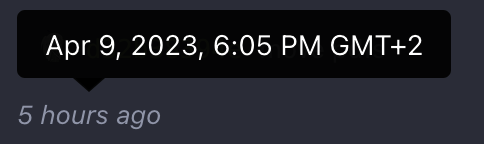
<img width="278" alt="Screenshot 2023-04-07 at 19 43 42"
src="https://user-images.githubusercontent.com/115237/230653601-d6517b9f-0988-445e-aa57-5ebfaf5039f3.png">