I think it's better if the primary actions have primary color instead of
green which fits better into the overall single-color UI design. This PR
currently replaces every green button with primary:

<img width="141" alt="Screenshot 2023-09-16 at 14 07 59"
src="843c1e50-4fb2-4ec6-84ba-0efb9472dcbe">
<img width="161" alt="Screenshot 2023-09-16 at 14 07 51"
src="9442195a-a3b2-4a42-b262-8377d6f5c0d1">

Modal actions now use uncolored/primary instead of previous green/red
colors. I also removed the box-shadow on all basic buttons:

<img width="259" alt="Screenshot 2023-09-16 at 14 16 39"
src="5beea529-127a-44b0-8d4c-afa7b034a490">
<img width="261" alt="Screenshot 2023-09-16 at 14 17 42"
src="4757f7b2-4d46-49bc-a797-38bb28437b88">

The change currently includes the "Merge PR" button, for which we might
want to make an exception to match the icon color there:

<img width="442" alt="Screenshot 2023-09-16 at 14 33 53"
src="993ac1a5-c94d-4895-b76c-0d872181a70b">
Hello,

The current package guide for cargo gives you only the git index, with
the HTTP Index stabilized being used as default for crates.io and being
better for most use-cases.

However, it's not documented that gitea supports the sparse spec, and it
does not require the _crates-index git repo for the sparse api.

I personally think we should push users to use the sparse instead of the
git repository. (Even let users disable crates-index repos if they only
want to use sparse)
Some small dashboard tweaks:

- Remove margin-bottom from divider so first item does not appear to
have un-equal margins
- Restore previous icon color
- Add slight margin-right to icon

Before:
<img width="783" alt="Screenshot 2023-08-31 at 00 10 28"
src="b75f70d7-8704-4afb-866d-fea0484c52d4">

After:
<img width="783" alt="Screenshot 2023-08-31 at 00 10 08"
src="50ed0c47-6f7c-449e-a054-13091369d43f">

---------

Co-authored-by: wxiaoguang <wxiaoguang@gmail.com>
Each change is tested manually line by line. There are too many changes
so I can't share dozens of screenshots.

In short:

1. `ui right` could be still used in `ui top attached header`, because
there is a special case.
2. A lot of `ui right` are just no-op, so they can be removed safely.
3. Some of the `ui right` should be replaced by `gt-float-right` (to
avoid breaking, leave them to the future).
4. A few of the `ui right` could be rewritten by flex.
This PR introduces a new UI element type for Gitea called `flex-item`.
It consists of a horizontal card with a leading, main and trailing part:

The idea behind it is that in Gitea UI, we have many cases where we use
this kind of layout, but it is achieved in many different ways:
- grid layout
- `.ui.list` with additional hacky flexbox
- `.ui.key.list` - looks to me like a style set originally created for
ssh/gpg key list, was used in many other places
- `.issue.list` - created for issue cards, used in many other places
- ...
This new style is based on `.issue.list`, specifically the refactoring
of it done in #25750.
In this PR, the new element is introduced and lots of templates are
being refactored to use that style. This allows to remove a lot of
page-specific css, makes many of the elements responsive or simply
provides a cleaner/better-looking way to present information.
A devtest section with the new style is also available.
<details>
<summary>Screenshots (left: before, right: after)</summary>


</details>
---------
Co-authored-by: Giteabot <teabot@gitea.io>
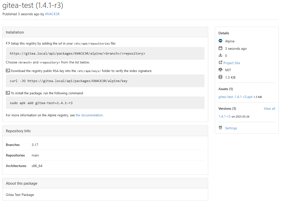
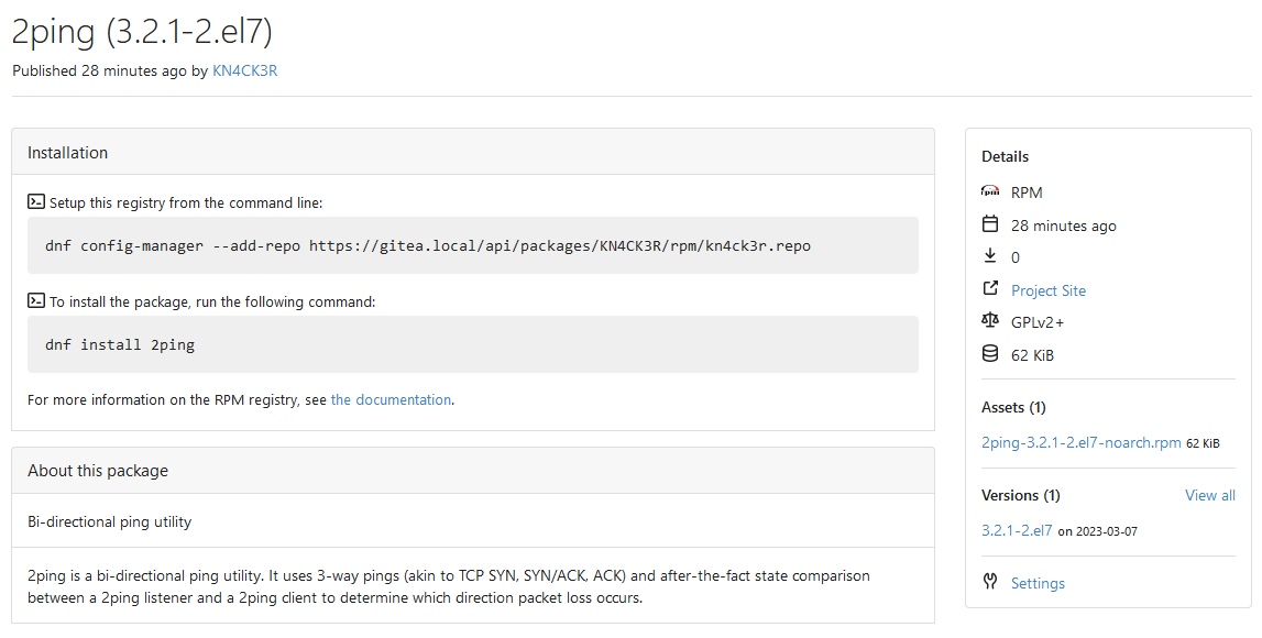
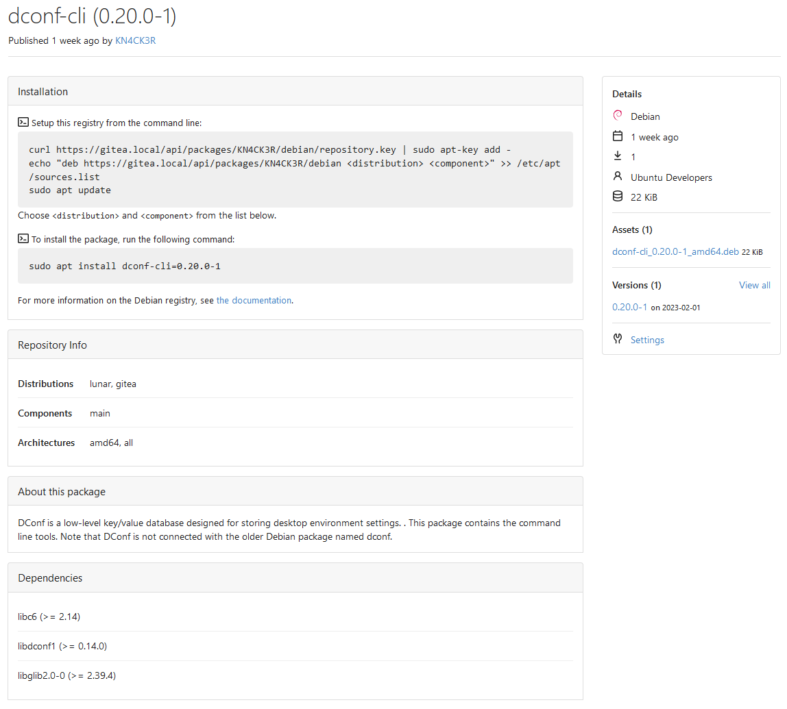
After RPM is supported with https://github.com/go-gitea/gitea/pull/23380
let's show the user
how to add the repo and install the RPM via all common package managers.

---------

Co-authored-by: Giteabot <teabot@gitea.io>
This PR does various modifications on the issue list shared template:
- restructure layout to achieve better responsiveness
- fix various style issues
- restructure styles (better result with less code :)
- remove numerous `gt-*` patches and other unneeded classes -> use
existing css classes
<details>
<summary>Before:</summary>


</details>
<details>
<summary>After:</summary>


</details>
---------
Co-authored-by: silverwind <me@silverwind.io>
The code was just copied&pasted, it causes problems now.

There are a lot (for every package) broken translations. eg:

```
# en-US
conda.documentation = For more information on the Conda registry, see
<a target="_blank" rel="noopener noreferrer" href="%s">the documentation</a>.

# fr-FR (and many languages)
conda.documentation=Pour plus d'informations sur le registre Conda, voir
<a target="_blank" rel="noopener noreferrer" href="https://docs.gitea.io/fr-fr/packages/conda/">la documentation</a>.
```


To resolve the problem fundamentally, use a general string, and trigger
the re-translating on Crowdin side.


And, it should really really really avoid introducing too much
copied&pasted code .......
Fix ::User Profile Page Project Tab Have Inconsistent Layout and Style
Added the big_avator for consistency in the all header_items tabs.
Fixes: #24871
> ### Description
> in the user profile page the `Packages` and `Projects` tab have small
icons for user but other tabs have bigger profile picture with user
info:
>
> ### Screenshots
> ### **For Packages And Projects:**
>

>
> ### **For Other Tabs:**
>

>
## Before

## After changes
Project View
<img width="1394" alt="image"
src="95d181d7-8e61-496d-9899-7b825c91ad56">
Packages View
<img width="1378" alt="image"
src="7f5fd60f-6b18-4fa8-8c56-7b0d45d1a610">
## Org view for projects page
<img width="1385" alt="image"
src="6400dc89-a5ae-4f0a-831b-5b6efa020d89">
## Org view for packages page
<img width="1387" alt="image"
src="4e1e9ffe-1e4b-4334-8657-de11b5fd31d0">
---------
Co-authored-by: wxiaoguang <wxiaoguang@gmail.com>
Co-authored-by: Giteabot <teabot@gitea.io>
Co-authored-by: silverwind <me@silverwind.io>
Various small enhancements to the actions list. Before and after:

<img width="1264" alt="Screenshot 2023-06-30 at 00 11 40"
src="bb4162ee-cdcf-4a73-b05e-f9521562edbb">
<img width="1264" alt="Screenshot 2023-06-30 at 00 09 51"
src="52a70ea9-4bb3-406e-904b-0fdaafde9582">

---------

Co-authored-by: Giteabot <teabot@gitea.io>
Related #25559

Current behaviour:
1. Deletion of a package version
2. Redirect to the owners package list

New behaviour:
1. Deletion of a package version
2.1. If there are more versions available, redirect to the package again
2.2. If there are no versions available, redirect to the owners package
list
Should look exactly like before for normal dividers. "Horizontal" ones
look better because they no longer use image backgrounds.

<img width="917" alt="Screenshot 2023-06-27 at 19 07 56"
src="d97d8dec-6859-44a8-85ba-e4549b4dd9df">

<img width="914" alt="Screenshot 2023-06-27 at 19 05 58"
src="8bf98544-2d82-4ebf-ac68-d6dc237bd6b2">

<img width="1246" alt="Screenshot 2023-06-27 at 19 00 42"
src="36a6bb21-6029-4f53-8bee-535f55c66fed">

<img width="344" alt="Screenshot 2023-06-27 at 18 58 15"
src="a9e70aee-8e6b-4ea1-9e93-19c9f96aec6e">
<img width="823" alt="Screenshot 2023-06-27 at 18 56 22"
src="e7a497cd-f262-4683-8872-23c3c8cce32f">

<img width="330" alt="Screenshot 2023-06-27 at 19 21 11"
src="42f24149-a655-4c7e-bd26-8ab52db6446b">
- Set
[type=search](https://developer.mozilla.org/en-US/docs/Web/HTML/Element/input/search)
- Disable spellcheck
- Set maxLength 255 that I found in `templates/repo/issue/search.tmpl`
- Remove unnecessary `max-width`, it does nothing

---------

Co-authored-by: delvh <dev.lh@web.de>
Co-authored-by: Giteabot <teabot@gitea.io>
Part of #25042

1. Added actor and status dropdowns first in case something is offtrack
and PR is too large.

2. Also added "No results matched." and "The workflow has no runs yet.",
and "No results matched." will show if there is no filter results and
there is no workflows (with [reference to github
action](https://github.com/go-gitea/gitea/actions/workflows/files-changed.yml?query=actor%3AGiteaBot))

Demo:


6e76292c-4c1f-450d-8b48-99944cfc920c


TODOs:

- [x] Get available status (same as those in `aggregateJobStatus`)
instead of getting from database
- [x] Use `JOIN` to get actors, actors order by name
- [x] Make self on top
Address
https://github.com/go-gitea/gitea/pull/25163#issuecomment-1599207916
Remove the unused "icon-button".
And fix the layout:
Without the dropdown icon:
```
{{svg "gitea-whitespace"}}
```

With the dropdown icon:
```
{{svg "gitea-whitespace" 16 "gt-mr-3"}}
{{svg "octicon-triangle-down" 14 "dropdown icon"}}
```

View diff:
https://github.com/go-gitea/gitea/pull/24738/files?diff=unified&w=1

Improve layout and functionality in review area:

<img width="439" alt="Screenshot 2023-05-15 at 20 10 01"
src="be10452b-5829-4927-8801-7b26a57b3dbd">

Remove the "Reviewers" timeline box that appears before the merge box.
it's a duplicate of the top-right review area and all functionality of
it has been moved to the other box:

<img width="868" alt="Screenshot 2023-05-15 at 19 39 31"
src="35489445-e54b-40d3-b3cf-38d029478f96">

Increase timeline item vertical padding from 12px to 16px:

<img width="449" alt="Screenshot 2023-05-15 at 19 43 50"
src="919c4f9d-a485-4f51-b08c-2c0fc714a413">

---------

Co-authored-by: Giteabot <teabot@gitea.io>
Co-authored-by: @awkwardbunny

This PR adds a Debian package registry. You can follow [this
tutorial](https://www.baeldung.com/linux/create-debian-package) to build
a *.deb package for testing. Source packages are not supported at the
moment and I did not find documentation of the architecture "all" and
how these packages should be treated.

---------

Co-authored-by: Brian Hong <brian@hongs.me>
Co-authored-by: techknowlogick <techknowlogick@gitea.io>
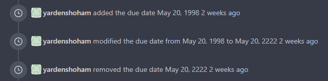
This refactors the `shared/datetime/short|long|full` templates into a
template helper function, which allows us to render absolute date times
within translatable phrases.
- Follows #23988
- The first attempt was in #24055
- This should help #22664
Changes:
1. Added the `DateTime` template helper that replaces the
`shared/datetime/short|long|full` templates
2. Used find-and-replace with varying regexes to replace the templates
from step 1 (for example, `\{\{template "shared/datetime/(\S+) \(dict
"Datetime" ([^"]+) "Fallback" ([^\)]+\)?) ?\)?\}\}` -> `{{DateTime "$1
$2 $3}}`)
3. Used the new `DateTime` helper in the issue due date timestamp
rendering
# Before
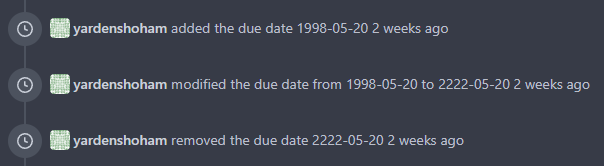
# After
---------
Signed-off-by: Yarden Shoham <git@yardenshoham.com>
Co-authored-by: wxiaoguang <wxiaoguang@gmail.com>
…; add trailing slash to PyPI repository URL (in accordance to PEP-503)

This should solve Issue #23980, by moving the space in front of the
package name and the package name out of the `gitea-origin-url` block.
It also adds a trailing slash to the PyPI repository URL in accordance
to [Python PEP-503](https://peps.python.org/pep-0503/).

Co-authored-by: Lunny Xiao <xiaolunwen@gmail.com>
The default command to setup a NuGet registry from the command line is:
```
dotnet nuget add source --name Gitea --username your_username --password your_token <gitea-origin-url/>
```
The feed name `Gitea` is hard-coded into the command template, so each
registry will by default have the same feed name. I know templates can
be overridden using the `custom` folder. But in my opinion, it's a good
practice to make a slight change in the default template to make the
feed name more context specific:
```
dotnet nuget add source --name {{.PackageDescriptor.Owner.Name}} --username your_username --password your_token <gitea-origin-url/>
```
This improves a lot of accessibility shortcomings.
Every possible instance of `<div class="button">` matching the command
`ag '<[^ab].*?class=.*?[" ]button[ "]' templates/ | grep -v 'dropdown'`
has been converted when possible.
divs with the `dropdown` class and their children were omitted as
1. more analysis must be conducted whether the dropdowns still work as
intended when they are a `button` instead of a `div`.
2. most dropdowns have `div`s as children. The HTML standard disallows
`div`s inside `button`s.
3. When a dropdown child that's part of the displayed text content is
converted to a `button`, the dropdown can be focused twice

Further changes include that all "gitea-managed" buttons with JS code
received an `e.preventDefault()` so that they don't accidentally submit
an underlying form, which would execute instead of cancel the action.
Lastly, some minor issues were fixed as well during the refactoring.

## Future improvements

As mentioned in
https://github.com/go-gitea/gitea/pull/23337#discussion_r1127277391,
`<a>`s without `href` attribute are not focusable.
They should later on be converted to `<button>`s.

---------

Co-authored-by: wxiaoguang <wxiaoguang@gmail.com>
Co-authored-by: silverwind <me@silverwind.io>
Co-authored-by: techknowlogick <techknowlogick@gitea.io>
Co-authored-by: Lunny Xiao <xiaolunwen@gmail.com>
This PR follows:
* #21986
* #22831
This PR also introduce customized HTML elements, which would also help
problems like:
* #17760
* #21429
* #21440
With customized HTML elements, there won't be any load-search-replace
operations, and it can avoid page flicking (which @silverwind cares a
lot).
Browser support:
https://developer.mozilla.org/en-US/docs/Web/API/Window/customElements
# FAQ
## Why the component has the prefix?
As usual, I would strongly suggest to add prefixes for our own/private
names. The dedicated prefix will avoid conflicts in the future, and it
makes it easier to introduce various 3rd components, like GitHub's
`relative-time` component. If there is no prefix, it's impossible to
introduce another public component with the same name in the future.
## Why the `custcomp.js` is loaded before HTML body? The `index.js` is
after HTML body.
Customized components must be registered before the content loading.
Otherwise there would be still some flicking.
`custcomp.js` should have its own dependencies and should be very light,
so it won't affect the page loading time too much.
## Why use `data-url` attribute but not use the `textContent`?
According to the standard, the `connectedCallback` occurs on the
tag-opening moment. The element's children are not ready yet.
## Why not use `{{.GuessCurrentOrigin $.ctx ...}}` to let backend decide
the absolute URL?
It's difficult for backend to guess the correct protocol(scheme)
correctly with zero configuration. Generating the absolute URL from
frontend can guarantee that the URL is 100% correct -- since the user is
visiting it.
# Screenshot
<details>
</details>
As discussed in #22847 the helpers in helpers.less need to have a
separate prefix as they are causing conflicts with fomantic styles

This will allow us to have the `.gt-hidden { display:none !important; }`
style that is needed to for the reverted PR.

Of note in doing this I have noticed that there was already a conflict
with at least one chroma style which this PR now avoids.

I've also added in the `gt-hidden` style that matches the tailwind one
and switched the code that needed it to use that.

Signed-off-by: Andrew Thornton <art27@cantab.net>

---------

Signed-off-by: Andrew Thornton <art27@cantab.net>
Co-authored-by: wxiaoguang <wxiaoguang@gmail.com>
partially fix#19345
This PR add some `Link` methods for different objects. The `Link`
methods are not different from `HTMLURL`, they are lack of the absolute
URL. And most of UI `HTMLURL` have been replaced to `Link` so that users
can visit them from a different domain or IP.
This PR also introduces a new javascript configuration
`window.config.reqAppUrl` which is different from `appUrl` which is
still an absolute url but the domain has been replaced to the current
requested domain.