* Show checkout instructions also when there is no permission to push,
for anyone who wants to locally test the changes.
* First checkout the branch exactly as is, without immediately having to
solve merge conflicts. Leave this to the merge step, since it's often
convenient to test a change without worrying about this.
* Use `git fetch -u`, so an existing local branch is updated when
re-testing the same pull request. But not the more risky `git fetch -f`
in to handle force pushes, as we don't want to accidentally overwrite
important local changes.
* Show different merge command depending on the chosen merge style,
interactively updated.
## Add border to file tree 'sub-items'
close#24766
view in `gitea-light`
<img width="275" alt="image"
src="f1bf8736-2db3-454f-86f5-d050a2fae3eb">
view in `gitea-dark`
<img width="296" alt="image"
src="053e2e6e-28f7-41d2-a139-1dae4df45929">
## Change the 'item-file' padding
Before that the 'item-file' only have padding when they in
'item-directory', which is too compact when 'item-file' after
'item-directory'
<details>

---------
Co-authored-by: silverwind <me@silverwind.io>
Close#26730
1. The `diff-detail-box` was abused, it shouldn't be used for
"DiffFileList/DiffFileTree".
2. Fix the sticky position for various screens.


WIP because:

- [x] Some calls set a `content-type` but send no body, can likely
remove the header
- [x] Need to check whether `charset=utf-8` has any significance on the
webauthn calls, I assume not as it is the default for json content.
- [x] Maybe `no-restricted-globals` is better for eslint, but will
require a lot of duplication in the yaml or moving eslint config to a
`.js` extension.
- [x] Maybe export `request` as `fetch`, shadowing the global.
I think it's better if the primary actions have primary color instead of
green which fits better into the overall single-color UI design. This PR
currently replaces every green button with primary:

<img width="141" alt="Screenshot 2023-09-16 at 14 07 59"
src="843c1e50-4fb2-4ec6-84ba-0efb9472dcbe">
<img width="161" alt="Screenshot 2023-09-16 at 14 07 51"
src="9442195a-a3b2-4a42-b262-8377d6f5c0d1">

Modal actions now use uncolored/primary instead of previous green/red
colors. I also removed the box-shadow on all basic buttons:

<img width="259" alt="Screenshot 2023-09-16 at 14 16 39"
src="5beea529-127a-44b0-8d4c-afa7b034a490">
<img width="261" alt="Screenshot 2023-09-16 at 14 17 42"
src="4757f7b2-4d46-49bc-a797-38bb28437b88">

The change currently includes the "Merge PR" button, for which we might
want to make an exception to match the icon color there:

<img width="442" alt="Screenshot 2023-09-16 at 14 33 53"
src="993ac1a5-c94d-4895-b76c-0d872181a70b">
1. Introduce lightweight `fetch` wrapper functions that automatically
sets csfr token, content-type and use it in `RepoActionView.vue`.
2. Fix a specific issue on `RepoActionView.vue` where a fetch network
error is shortly visible during page reload sometimes. It can be
reproduced by F5-in in quick succession on the actions view page and was
also producing a red error box on the page.

Once approved, we can replace all current `fetch` uses in UI with this
in another PR.

---------

Co-authored-by: Giteabot <teabot@gitea.io>
The [recommended order](https://vuejs.org/guide/scaling-up/sfc.html) for
SFC blocks is script -> template -> style, which we were violating
because template and script were swapped. I do find script first also
easier to read because the imports are on top, letting me immideatly see
a component's dependencies.

This is a pure cut-paste refactor with some removal of some empty lines.

---------

Co-authored-by: Lauris BH <lauris@nix.lv>
Each change is tested manually line by line. There are too many changes
so I can't share dozens of screenshots.

In short:

1. `ui right` could be still used in `ui top attached header`, because
there is a special case.
2. A lot of `ui right` are just no-op, so they can be removed safely.
3. Some of the `ui right` should be replaced by `gt-float-right` (to
avoid breaking, leave them to the future).
4. A few of the `ui right` could be rewritten by flex.
Fix#26731
Almost all "tabindex" in code are incorrect.
1. All "input/button" by default are focusable, so no need to use "tabindex=0"
2. All "div/span" by default are not focusable, so no need to use "tabindex=-1"
3. All "dropdown" are focusable by framework, so no need to use "tabindex"
4. Some tabindex values are incorrect (eg: `new_form.tmpl`), so remove them
Co-authored-by: Giteabot <teabot@gitea.io>
Removed CSS helper classes (some of them are not useful while some of
them are abused often)
* `gt-db`: in most cases it could be replaced by `gt-df` and the flex
layout should be encouraged. Other cases: either it does need the
`gt-df` (eg: by using `div` directly) or it is an abuse (eg: the warning
message in a form)
* `gt-di`: it doesn't seem useful, or it could be replaced by `gt-dib`
in most cases.
* `gt-dif`: not useful, it could be replaced by `flex-text-inline` or
`gt-df`
* `gt-js`: never used
* All `<i class="icon gt-df gt-ac gt-jc">` could be written as `<i
class="icon">`
## Some UI samples
### Admin Notice

### Admin Stacktrace

### Org Home

### Org Team Repo

### Release List

### User Setting Application Token Scope

Co-authored-by: Giteabot <teabot@gitea.io>
Replace Fomantic `loader` CSS module with our existing `is-loading`
spinner. Only three places in the UI used this module, which are
pictured here:

imagediff:
<img width="1237" alt="Screenshot 2023-08-22 at 22 18 01"
src="b0d82531-f05e-43c6-9e5b-1bfc268c056d">

webauthn:
<img width="894" alt="Screenshot 2023-08-22 at 22 05 05"
src="7b583425-d944-474a-a57a-22a65bbd8b29">

heatmap (I removed the previous loading text, it was unreadable because
it was tiny and on fast machines only visible for a fraction of a
second):
<img width="764" alt="Screenshot 2023-08-22 at 22 18 44"
src="1c7472d6-3e17-4224-a992-d8c0b380cc73">

Also, heatmap container does not resize any more after loading now and
previous duplicate id `user-heatmap` is gone.

---------

Co-authored-by: wxiaoguang <wxiaoguang@gmail.com>
Adds
[eslint-plugin-vue-scoped-css](https://github.com/future-architect/eslint-plugin-vue-scoped-css)
and fixes discovered issues which are:

- 1 unused selector
- 3 selectors with `.full.height` parent in a `<style scoped>` block so
the rule could not find the parent. Move these into the unscoped block
instead. They worked before and after.
In GitHub, we can not rerun jobs if the workflow is disabled.

---------

Co-authored-by: silverwind <me@silverwind.io>
Co-authored-by: wxiaoguang <wxiaoguang@gmail.com>
Fix some layout / user-interaction problems and close#25650 , the code
has been simplified (+46 −108)
<details>

</details>
---------
Co-authored-by: delvh <dev.lh@web.de>
Before:

After:

In current design, the clickable area is too small, and it is hard to
find the correct clickable area as the area with background color (div
with class name `job-brief-item selected`) is bigger than it.
---------
Co-authored-by: Giteabot <teabot@gitea.io>
Previously, the tooltip for this button was only shown after opening and
closing it once because it was only set after the server response, now
it shows before opening it.
Ressurect lost changes from
https://github.com/go-gitea/gitea/pull/24451.

- Always show icons for each entry in the menu
- Make all checkboxes toggle only their feature, e.g. "seconds" and
"timestamps" can now be toggled on together.
- Reorder the items

<img width="845" alt="Screenshot 2023-08-01 at 19 19 27"
src="8a76e9bf-7966-42a6-87c9-e88cdddaec82">

---------

Co-authored-by: Giteabot <teabot@gitea.io>
This PR adds a new dropdown to select a commit or a commit range
(shift-click like github) of a Pull Request.
After selection of a commit only the changes of this commit will be shown.
When selecting a range of commits the diff of this range is shown.
This allows to review a PR commit by commit or by viewing only commit ranges.
The "Show changes since your last review" mechanism github uses is implemented, too.
When reviewing a single commit or a commit range the "Viewed" functionality is disabled.
## Screenshots
### The commit dropdown

### Selecting a commit range

### Show changes of a single commit only

### Show changes of a commit range

Fixes https://github.com/go-gitea/gitea/issues/20989
Fixes https://github.com/go-gitea/gitea/issues/19263
---------
Co-authored-by: silverwind <me@silverwind.io>
Co-authored-by: KN4CK3R <admin@oldschoolhack.me>
Co-authored-by: wxiaoguang <wxiaoguang@gmail.com>
Co-authored-by: delvh <dev.lh@web.de>
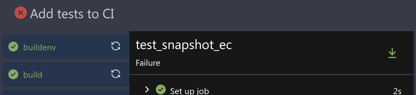
If there's no logs, you can also click the download button, then you
will get `job is not started` page

https://gitea.com/yp05327/testrepo/actions/runs/38
After:
If there's no steps displayed, the download button will be disabled.

- Send request to get branch/tag list, use loading icon when waiting for
response.
- Only fetch when the first time branch/tag list shows.
- For backend, removed assignment to `ctx.Data["Branches"]` and
`ctx.Data["Tags"]` from `context/repo.go` and passed these data wherever
needed.
- Changed some `v-if` to `v-show` and used native `svg` as mentioned in
https://github.com/go-gitea/gitea/pull/25719#issuecomment-1631712757 to
improve perfomance when there are a lot of branches.
- Places Used the dropdown component:
Repo Home Page
<img width="1429" alt="Screen Shot 2023-07-06 at 12 17 51"
src="6accc7b6-8d37-4e88-ae1a-bd2b3b927ea0">
Commits Page
<img width="1431" alt="Screen Shot 2023-07-06 at 12 18 34"
src="2d0bf306-d1e2-45a8-a784-bc424879f537">
Specific commit -> operations -> cherry-pick
<img width="758" alt="Screen Shot 2023-07-06 at 12 23 28"
src="1e557948-3881-4e45-a625-8ef36d45ae2d">
Release Page
<img width="1433" alt="Screen Shot 2023-07-06 at 12 25 05"
src="3ec82af1-15a4-4162-a50b-04a9502161bb">
- Demo
d45d266b-3eb0-465a-82f9-57f78dc5f9f3
- Note:
UI of dropdown menu could be improved in another PR as it should apply
to more dropdown menus.
Fix#14180
---------
Co-authored-by: silverwind <me@silverwind.io>
Co-authored-by: wxiaoguang <wxiaoguang@gmail.com>
current actions artifacts implementation only support single file
artifact. To support multiple files uploading, it needs:

- save each file to each db record with same run-id, same artifact-name
and proper artifact-path
- need change artifact uploading url without artifact-id, multiple files
creates multiple artifact-ids
- support `path` in download-artifact action. artifact should download
to `{path}/{artifact-path}`.
- in repo action view, it provides zip download link in artifacts list
in summary page, no matter this artifact contains single or multiple
files.
Followup to https://github.com/go-gitea/gitea/pull/25935 which has
missed to change the icon on the repolist because the logic is not
shared with templates.

Co-authored-by: Giteabot <teabot@gitea.io>
Monaco can not deal with color formats other than 6-digit hex, so we
convert the colors for it via new
[`tinycolor2`](https://github.com/bgrins/TinyColor) dependency (5kB
minzipped).

Also, with the addition of the module, we can replace the existing
`hexToRGBColor` usage, I verified it is compatible with the current
tests before removing the function.

Fixes: https://github.com/go-gitea/gitea/issues/25770
Various small enhancements to the actions list. Before and after:

<img width="1264" alt="Screenshot 2023-06-30 at 00 11 40"
src="bb4162ee-cdcf-4a73-b05e-f9521562edbb">
<img width="1264" alt="Screenshot 2023-06-30 at 00 09 51"
src="52a70ea9-4bb3-406e-904b-0fdaafde9582">

---------

Co-authored-by: Giteabot <teabot@gitea.io>
Close#24593
Some behavior:
- If log step line in hash exists, expand the step and scroll to the log
line.
- If step exists but line not exists, the step will be expanded.
- If step not exists, stays on the job's page.
Some Notes:
- Changed mounted to async because need to await for first `loadJob` so
`currentJobStepsStates` can be initialized and used in
`hashChangeListener `.
---------
Co-authored-by: silverwind <me@silverwind.io>
Co-authored-by: wxiaoguang <wxiaoguang@gmail.com>
Right now rerun icon on action view component will not be seen when
duration text length is long, because the wrapper `job-brief-info` has a
fixed width, and the svg is squeezed. The way to fix this in this PR is
to change width to `fit-content` and exchange position of duration text
and rerun svg.

Before (rerun svg not shown on hover):

<img width="1401" alt="Screen Shot 2023-06-27 at 12 53 41"
src="bb3f62ec-8c56-4dbc-96f1-718b50426d91">

After:

<img width="1409" alt="Screen Shot 2023-06-27 at 12 50 59"
src="620aa02c-2326-408d-a763-453f48f42c40">
- Set
[type=search](https://developer.mozilla.org/en-US/docs/Web/HTML/Element/input/search)
- Disable spellcheck
- Set maxLength 255 that I found in `templates/repo/issue/search.tmpl`
- Remove unnecessary `max-width`, it does nothing

---------

Co-authored-by: delvh <dev.lh@web.de>
Co-authored-by: Giteabot <teabot@gitea.io>
Save another 50KB of CSS by removing unused and useless Fomantic
variants.

Removed the last instance if a `tertiary` button and fixed a TODO:

<img width="509" alt="Screenshot 2023-06-15 at 22 34 36"
src="8a16ae7b-2b17-439b-a096-60a52724e3d6">
The current UI to create API access tokens uses checkboxes that have a
complicated relationship where some need to be checked and/or disabled
in certain states. It also requires that a user interact with it to
understand what their options really are.

This branch changes to use `<select>`s. It better fits the available
options, and it's closer to [GitHub's
UI](https://github.com/settings/personal-access-tokens/new), which is
good, in my opinion. It's more mobile friendly since the tap-areas are
larger. If we ever add more permissions, like Maintainer, there's a
natural place that doesn't take up more screen real-estate.

This branch also fixes a few minor issues:

- Hide the error about selecting at least one permission after second
submission
- Fix help description to call it "authorization" since that's what
permissions are about (not authentication)

Related: #24767.

<img width="883" alt="Screenshot 2023-06-07 at 5 07 34 PM"
src="6b63d807-c9be-4a4b-8e53-ecab6cbb8f76">

---

When it's open:

<img width="881" alt="Screenshot 2023-06-07 at 5 07 59 PM"
src="2432c6d0-39c2-4ca4-820e-c878ffdbfb69">
An error occurs when clicking on `show full screen` on action page.

<img width="1440" alt="Screen Shot 2023-06-12 at 13 06 52"
src="1d4ded3c-fb77-4dd8-9201-24d0696f96eb">

class name has changed in #25134, so the selector is not working.
Enhance the selectors to fix this.