Part of #27065

This PR touches functions used in templates. As templates are not static
typed, errors are harder to find, but I hope I catch it all. I think
some tests from other persons do not hurt.
As title, that's simmilar with github.


---------
Signed-off-by: a1012112796 <1012112796@qq.com>
Co-authored-by: silverwind <me@silverwind.io>
Co-authored-by: Jason Song <i@wolfogre.com>
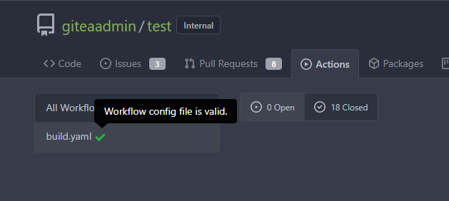
Various small enhancements to the actions list. Before and after:

<img width="1264" alt="Screenshot 2023-06-30 at 00 11 40"
src="bb4162ee-cdcf-4a73-b05e-f9521562edbb">
<img width="1264" alt="Screenshot 2023-06-30 at 00 09 51"
src="52a70ea9-4bb3-406e-904b-0fdaafde9582">

---------

Co-authored-by: Giteabot <teabot@gitea.io>
Part of #25042

1. Added actor and status dropdowns first in case something is offtrack
and PR is too large.

2. Also added "No results matched." and "The workflow has no runs yet.",
and "No results matched." will show if there is no filter results and
there is no workflows (with [reference to github
action](https://github.com/go-gitea/gitea/actions/workflows/files-changed.yml?query=actor%3AGiteaBot))

Demo:


6e76292c-4c1f-450d-8b48-99944cfc920c


TODOs:

- [x] Get available status (same as those in `aggregateJobStatus`)
instead of getting from database
- [x] Use `JOIN` to get actors, actors order by name
- [x] Make self on top
We should just show all runs. This removes the filtering altogether.
- Replaces https://github.com/go-gitea/gitea/pull/24553
# Before


# After

---------
Signed-off-by: Yarden Shoham <git@yardenshoham.com>
Partial regression of #24393, not only regression, but broken for long
time, 24393 didn't really improve it but used wrong `overflow: scroll`.

Actually, that "ui secondary filter menu labels" shouldn't be set as
scrollable (I missed that at that time), the problem is: if a "ui menu"
has "dropdown" items, then it should not be scrollable. Otherwise the
dropdown menu can't be shown correctly.

And there are more problems:

* The "issue-filters" shouldn't be used anywhere else (copying&pasting
problem again ....)
* There is also an "issue-actions" container, it should also be fixed.
* There are similar problems on the milestone page.
* The old comment in code: "grid column" doesn't work well.

The major changes of this PR are: use "flex: 1" instead of "ui grid
column".

After this PR, not 100% perfect but much better than before.
Close#24302
Part of #24229, Follows #24246
This PR focused on CSS style fine-tune, main changes:
1. Give `.ui.ui.ui.container` a width of `1280px` with a max-width of
`calc(100vw - 64px)`, so the main contents looks better on large
devices.
2. Share styles for table elements in all levels settings pages to fix
overflow of runners table on mobile and for consistency (The headers on
mobile can be further improved, but haven't found a proper way yet).
3. Use [stackable
grid](https://fomantic-ui.com/collections/grid.html#stackable) and
[device column width](https://fomantic-ui.com/examples/responsive.html)
for responsiveness for some pages (repo/org collaborators settings
pages, org teams related page)
4. Fixed#24302 by sharing label related CSS in reporg.css
5. Fine tune repo tags settings page
---------
Co-authored-by: wxiaoguang <wxiaoguang@gmail.com>
Follow:
* #23574
* Remove all ".tooltip[data-content=...]"

Major changes:

* Remove "tooltip" class, use "[data-tooltip-content=...]" instead of
".tooltip[data-content=...]"
* Remove legacy `data-position`, it's dead code since last Fomantic
Tooltip -> Tippy Tooltip refactoring
* Rename reaction attribute from `data-content` to
`data-reaction-content`
* Add comments for some `data-content`: `{{/* used by the form */}}`
* Remove empty "ui" class
* Use "text color" for SVG icons (a few)